BYOMA REFRESH

The Problem


BYOMA being such a young brand needed a new visual identity with assets beginning to feel stale, particularly with legacy products. The older assets (Left) were inconsistent and gave off a childlike feel to the products which does not represent the brands efficacy and science-backed products.
The Solution
There are 3 key areas for improvement:
Lighting
Styling
Dynamicism
1.
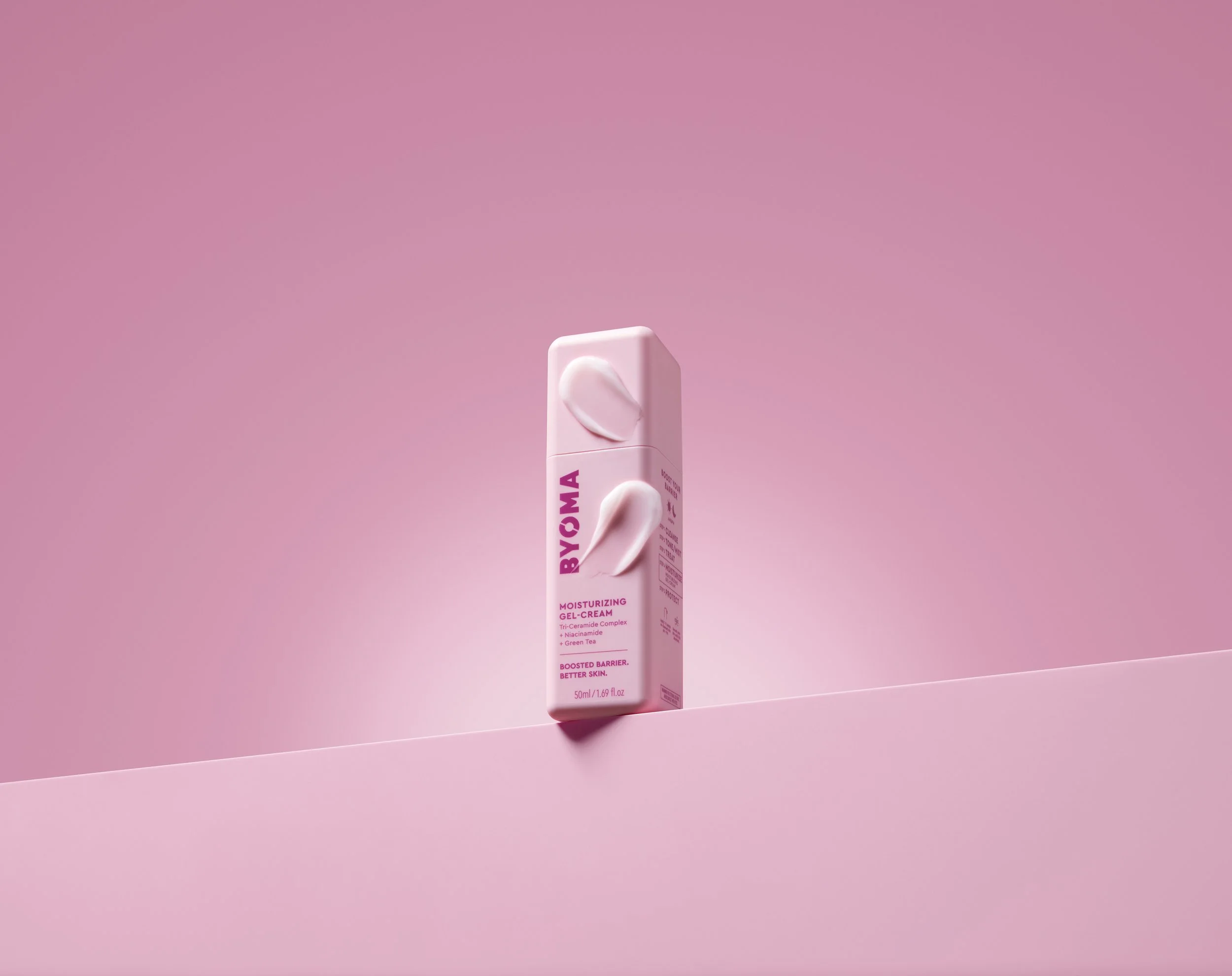
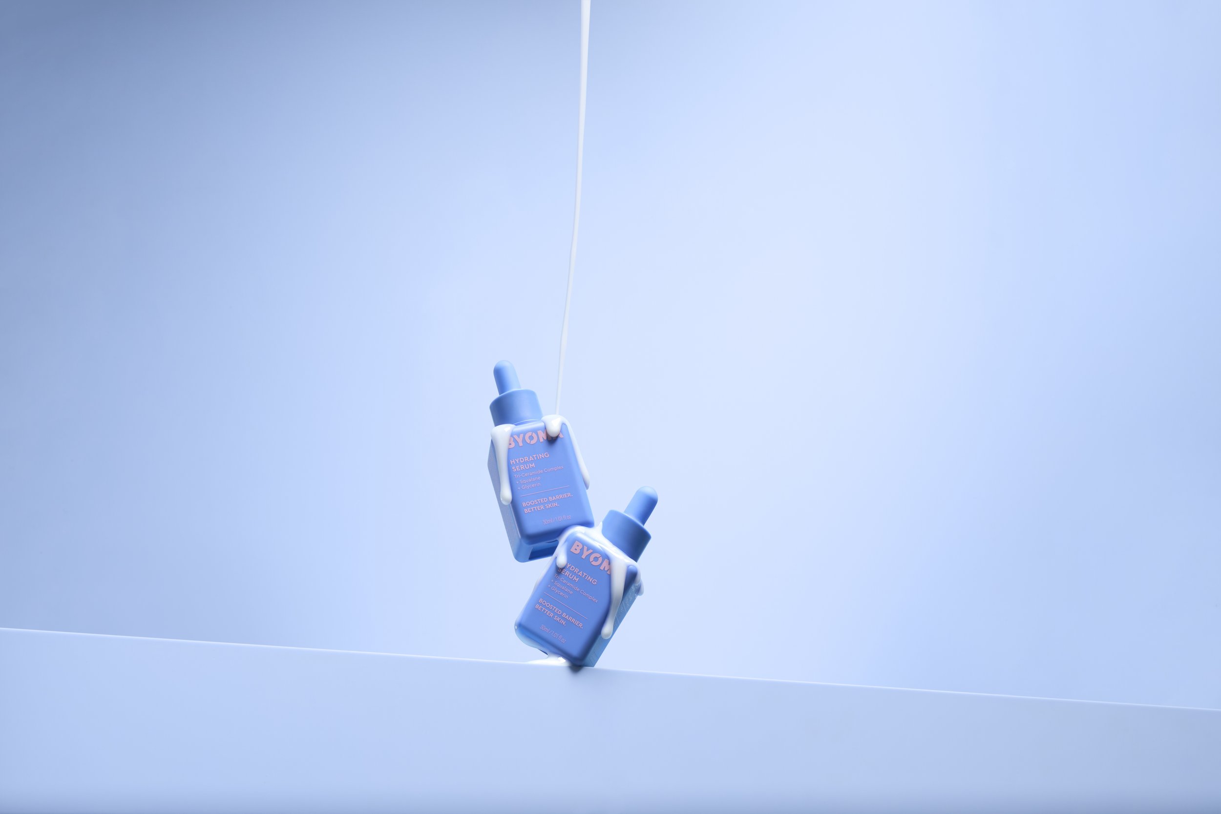
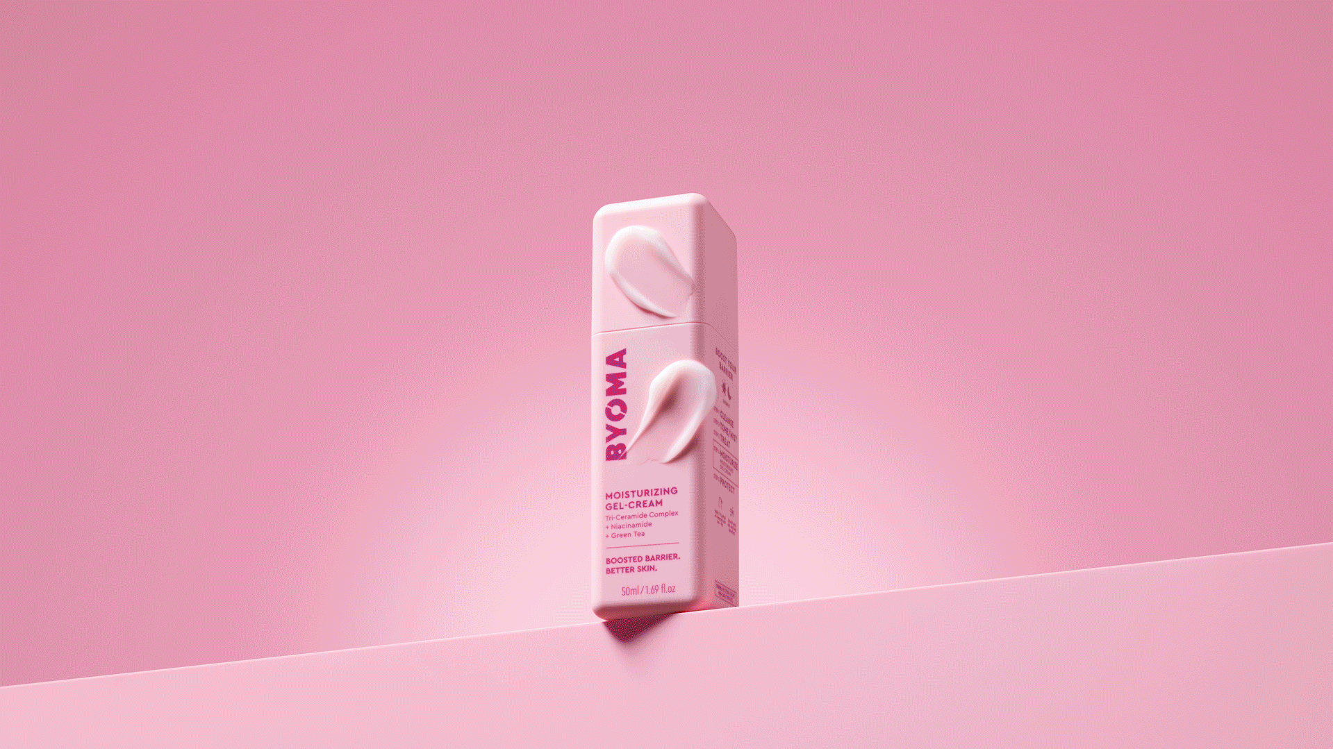
LIGHTING


More directional, intentional light creates depth, separates the subject from the background, and reveals texture and form in a way flat light simply can’t. Dynamic lighting introduces contrast and hierarchy, giving the viewer’s eye a clear place to land and a reason to stay.
2.
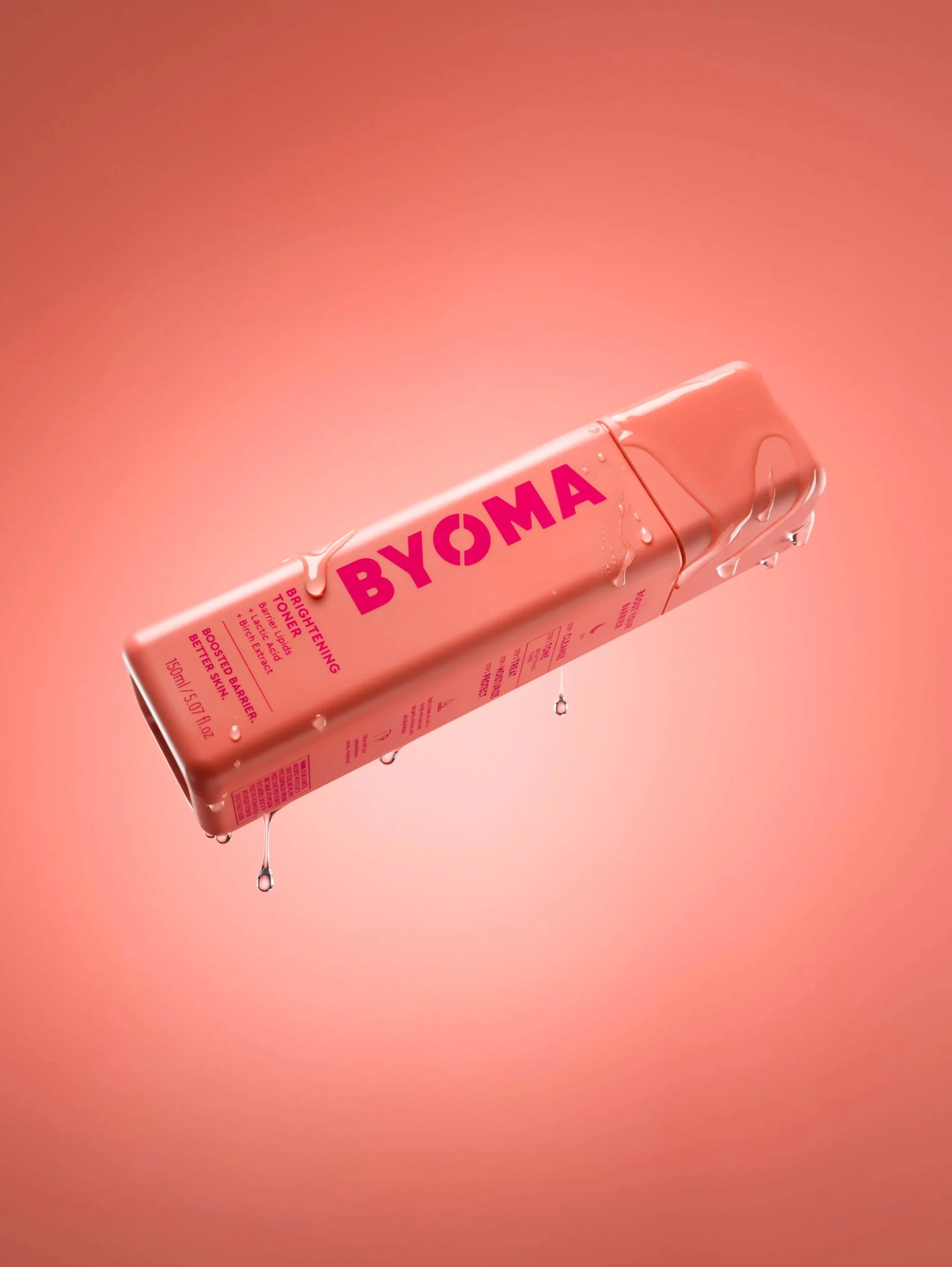
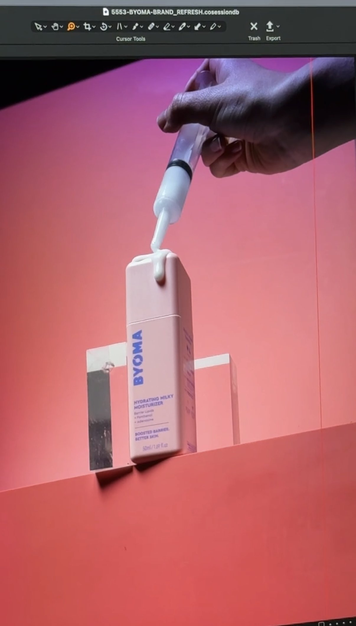
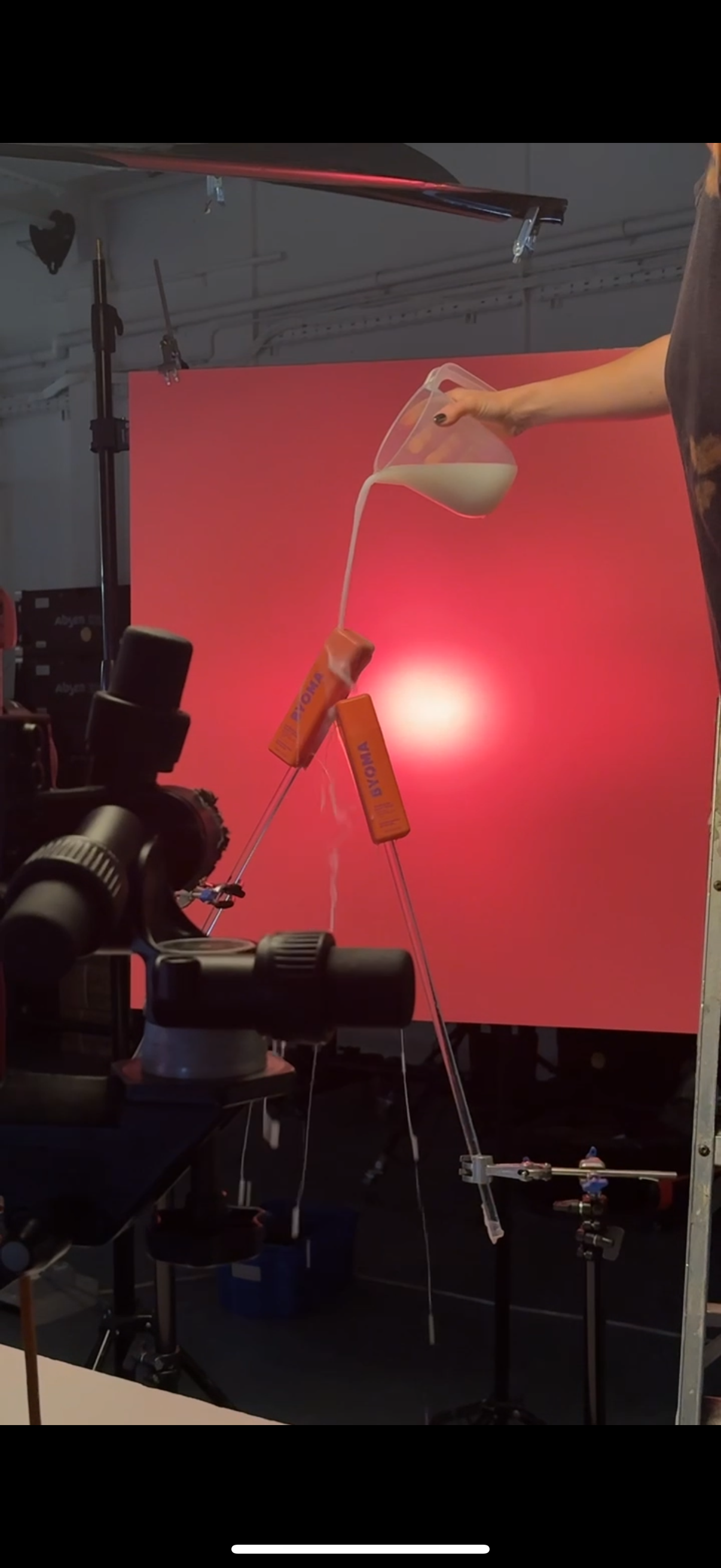
STYLING
Some of the most compelling textures come from letting go of perfection and embracing a bit of chaos on set. Being dynamic; pouring, spraying, layering, and reacting in the moment, creates organic textures that feel lived-in and real rather than manufactured. That controlled chaos introduces energy and unpredictability, giving the image character and helping the product stand out with a sense of movement and authenticity.
3.
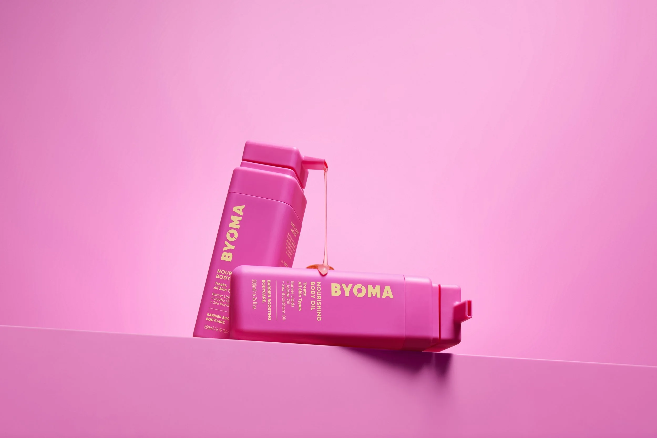
DYNAMICISM

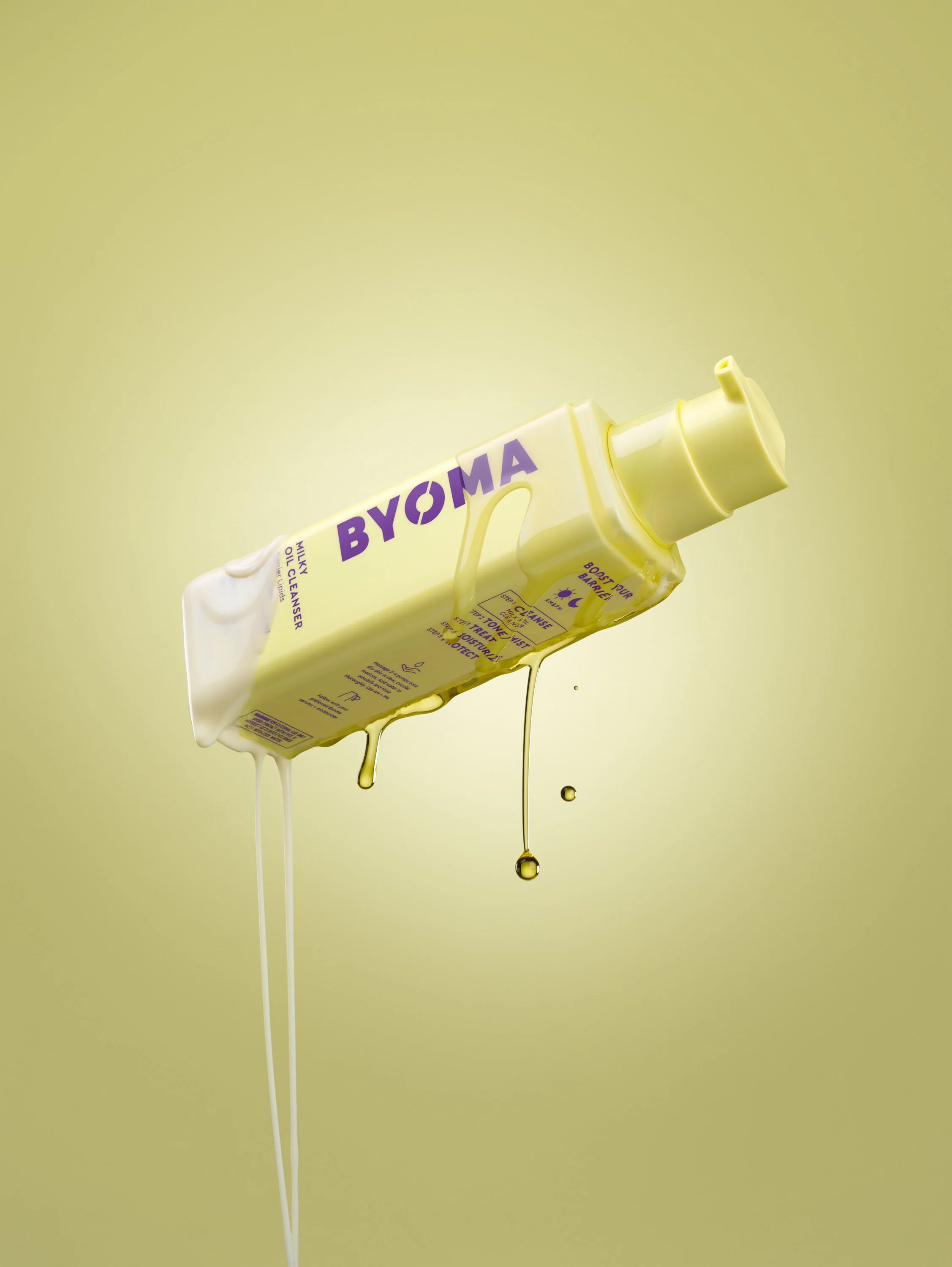
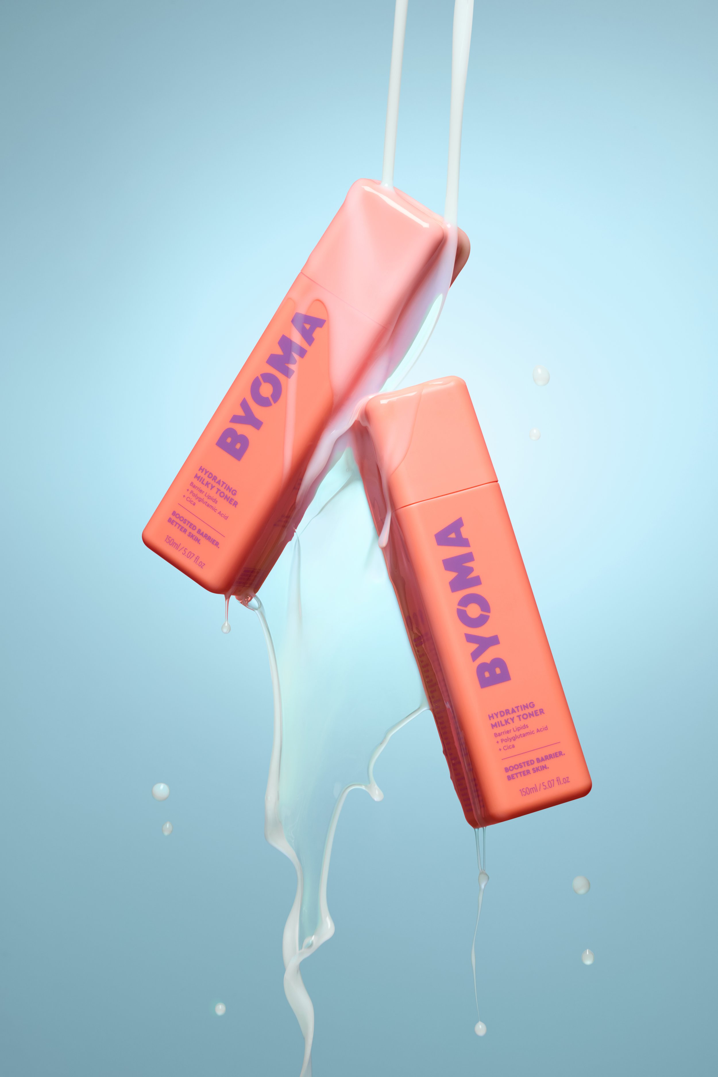
Strong product images come from the collaboration between lighting and styling, especially when texture is involved. Working closely with a product stylist allows you to shape light around materials, surfaces, and details so textures read with intention rather than distraction. When lighting and styling are aligned, texture becomes a storytelling tool that adds depth, realism, and tactile appeal to the image.